The charts explained
A project turns your results into charts. The Dashboard gives you the overview, and the Insights pages go deeper, each with its own filters.
The screenshots below come from a demo survey of 12 camera sites across Pennsylvania. The photos are real, from the ENA24 dataset, but we edited the capture times in the files to build a survey that spreads over a season and several cameras. So the animals and the species are genuine, while the dates, trends and trap nights are made up for the demo.
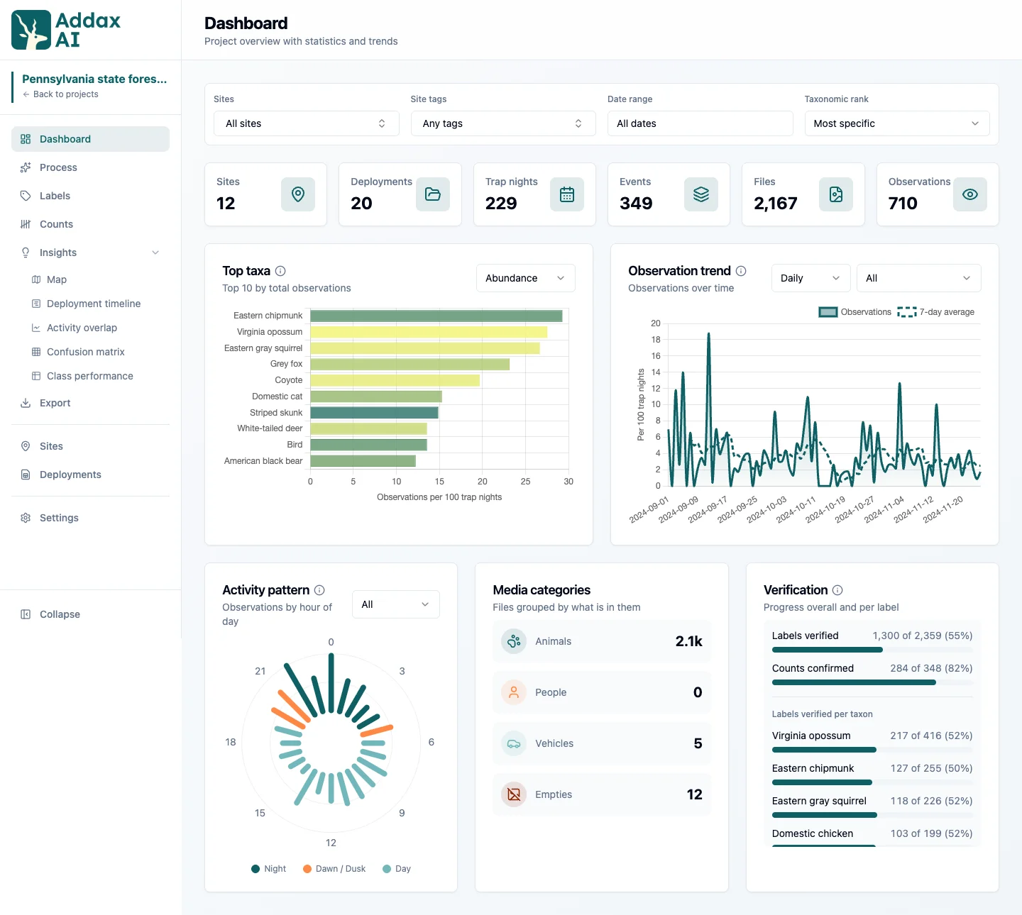
Dashboard
The Dashboard is the quick overview: how many sites, deployments, trap nights, and observations, plus the top species, a trend over time, and the day and night activity pattern.
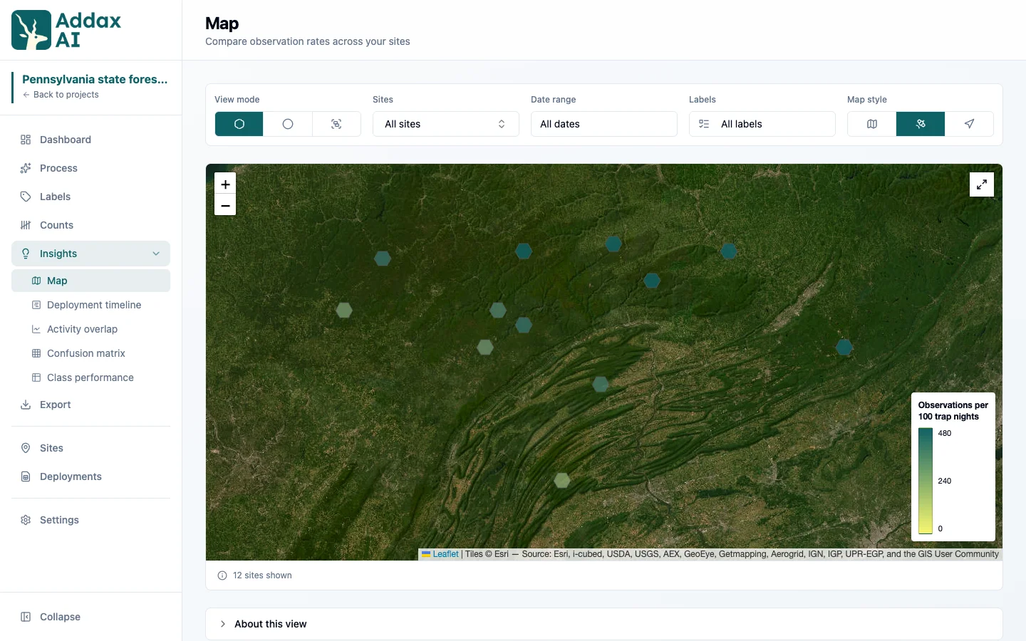
Map
Each camera site on a map, coloured by its observation rate per 100 trap nights. You can switch how the sites are drawn: one marker per site, nearby sites merged into a hex grid, or nearby sites grouped into clusters. Deployments with no site do not appear. Map style changes the background: Light, Satellite, or OpenStreetMap. Satellite is the useful one when you want to see the habitat around a camera, like where the forest gives way to open ground.
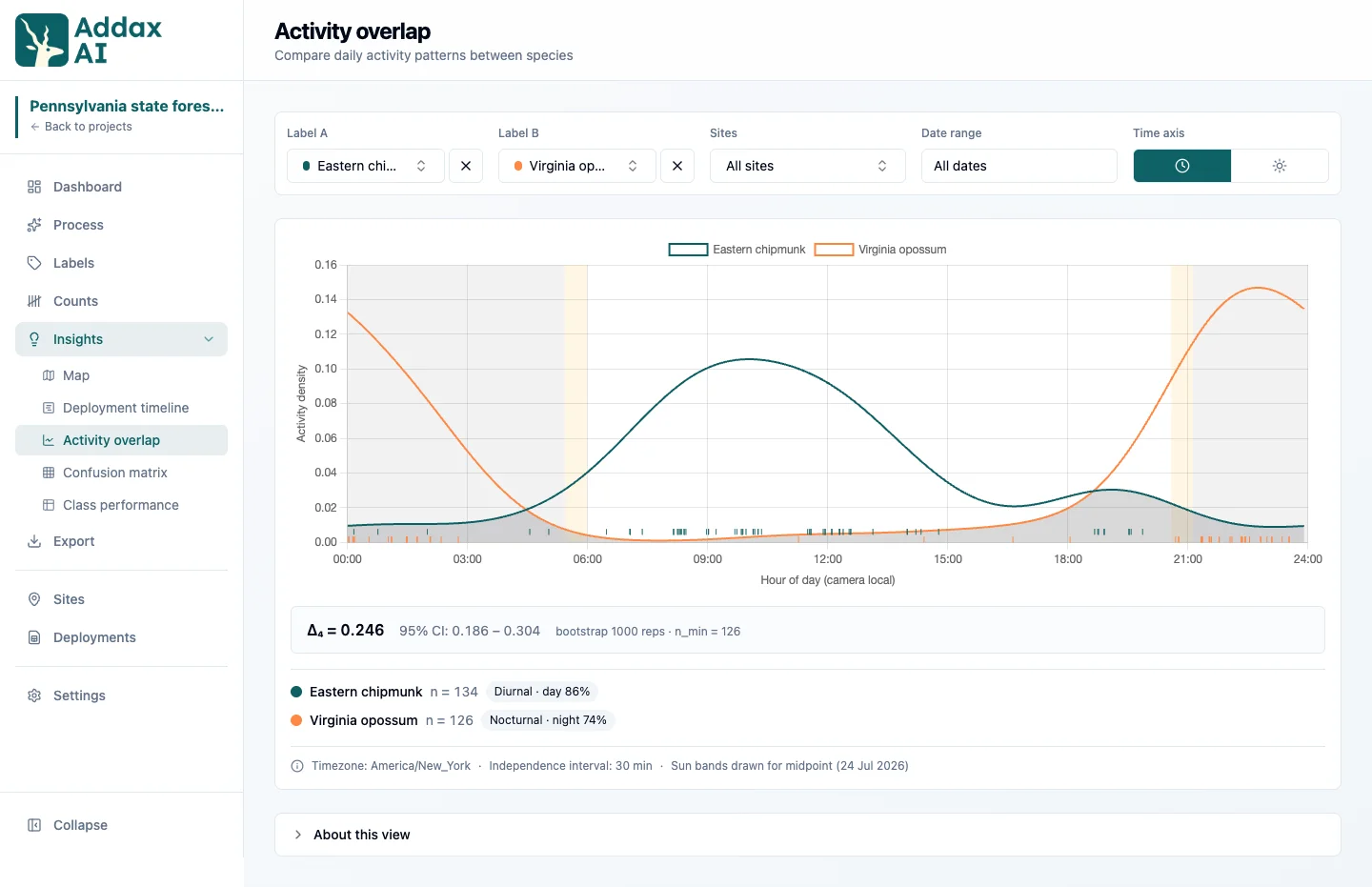
Activity overlap
Compare the daily activity of one or two species. With two species selected, the chart also shows the overlap coefficient: 0 means the two are never active at the same hours, 1 means their patterns are identical. Each species is also labelled diurnal (day), nocturnal (night), crepuscular (dawn and dusk) or cathemeral (no clear preference, active day and night). In the demo, the opossum comes out nocturnal and the chipmunk diurnal.
You can read the day on two different clocks. Clock time is the plain 24 hour day. Sun time stretches each day so that sunrise and sunset line up across the whole survey. Use it when your data spans seasons or sites: 06:00 in December and 06:00 in June are not the same moment relative to dawn, and clock time would blur that difference away. It needs site coordinates to work out the sun.
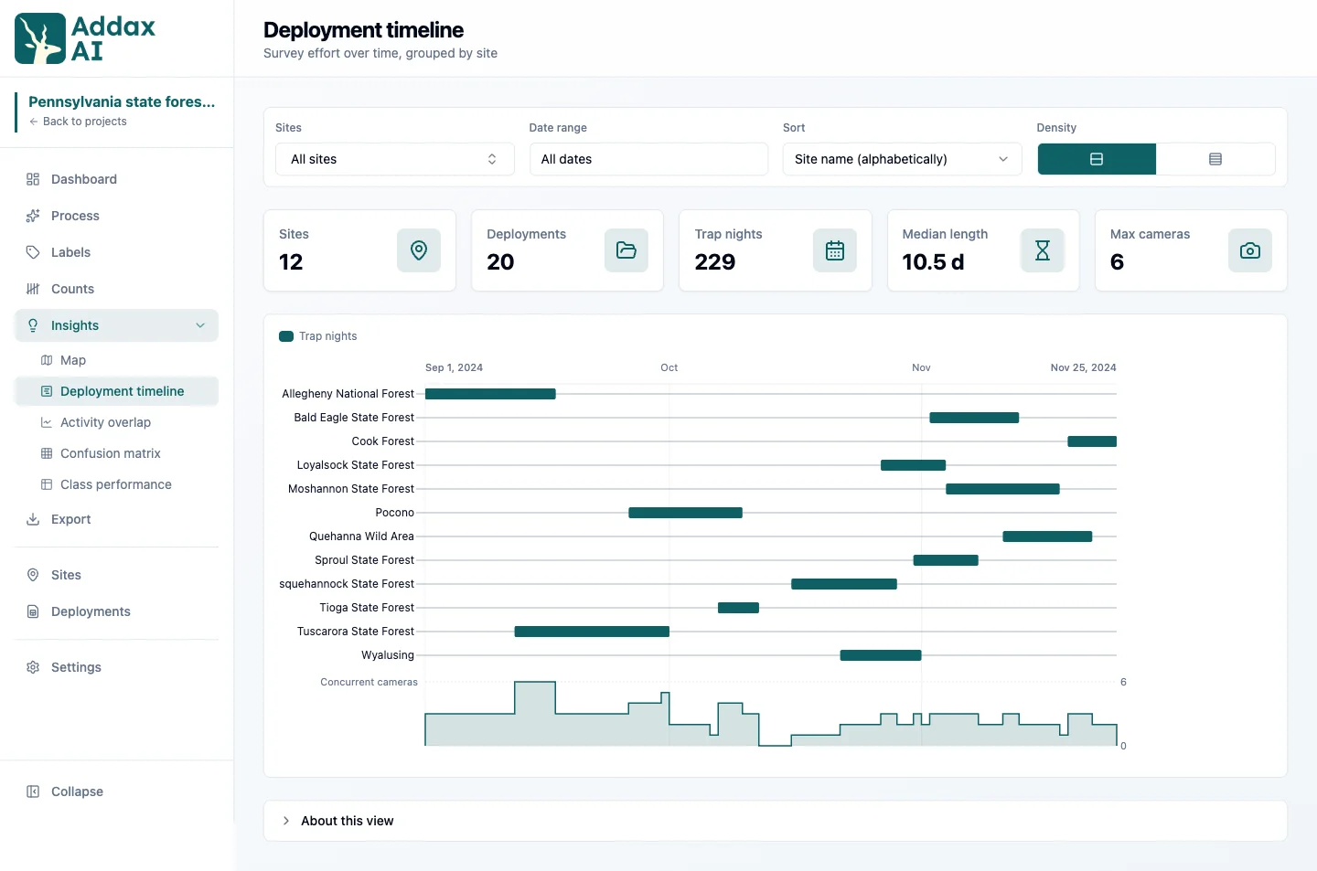
Deployment timeline
One bar per deployment, showing when each camera was active and what it recorded. Below it you see how many cameras ran at the same time, which is the quickest way to spot a gap in your survey effort.
Confusion matrix and class performance
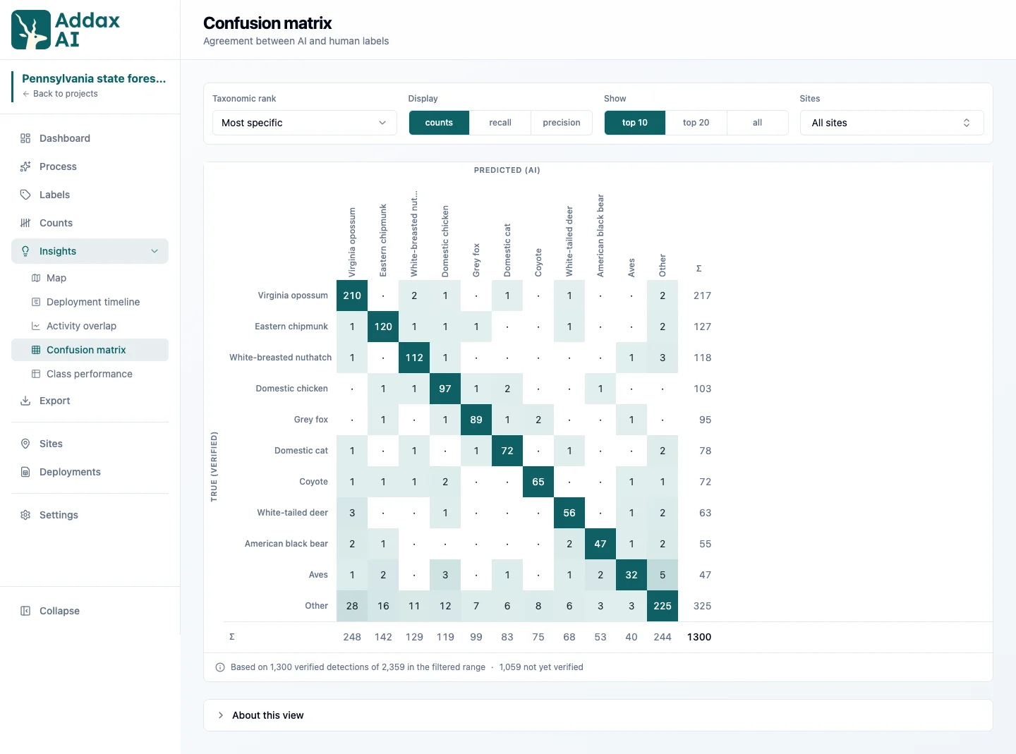
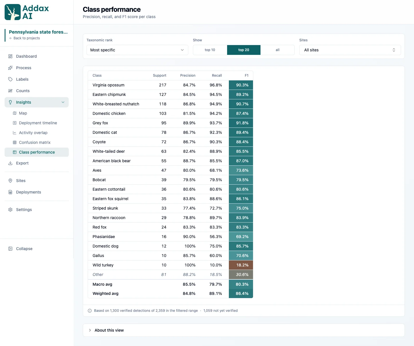
Where you have verified labels, these two views compare the AI's labels against your verified ones. The confusion matrix shows where the AI mixes up species. Class performance shows accuracy per species. Both only use detections you verified, so they stay empty until you have checked some labels.
Insights need capture times and, for the map, site coordinates. Files with no readable timestamp are still detected and classified, but they drop out of the time-based views.